Your coffee label was probably designed on a laptop screen. Zoomed in. Against a white background. Maybe with a glass of water nearby.
But the buyer who picks it up isn't looking at a screen. They're standing in a café, a specialty food shop, or a grocery aisle — making a decision in about three seconds, surrounded by ten other bags fighting for the same attention.
That gap — between how labels are designed and where they actually compete — is where most indie roaster packaging falls short. Not because the design is bad. Because it was built for the wrong context.
Here are the four elements that make a coffee label work where it actually matters: on the shelf.
Element 1 — Clarity: What Is This Coffee and Who Is It For?
A buyer should know three things in under three seconds: what the coffee is, what the roast level is, and whether it's meant for them.
If your label requires a closer look to answer any of those questions, you've already lost the decision-making moment. The buyer moves on.
The 3-Second Test
Hold your label at arm's length and read it as a stranger would — someone who has never heard of your brand. Ask:
- What is this coffee? (Origin or blend name — readable at a glance?)
- What's the roast level? (Light, medium, dark — clear and findable?)
- Who is this for? (Specialty drinker? Gift buyer? Daily drinker?)
If you can't answer all three in three seconds, your hierarchy needs work before your design does.
What Buyers Actually Need to Know
Clarity doesn't mean minimal. It means prioritized. Your label can have rich detail — tasting notes, processing method, altitude, farm name — but that detail should support the primary message, not compete with it.
The mistake we see most often: roasters front-load the technical information because they're proud of it, while burying the information buyers actually use to make a decision. Lead with what the buyer needs. Follow with what the enthusiast will love.
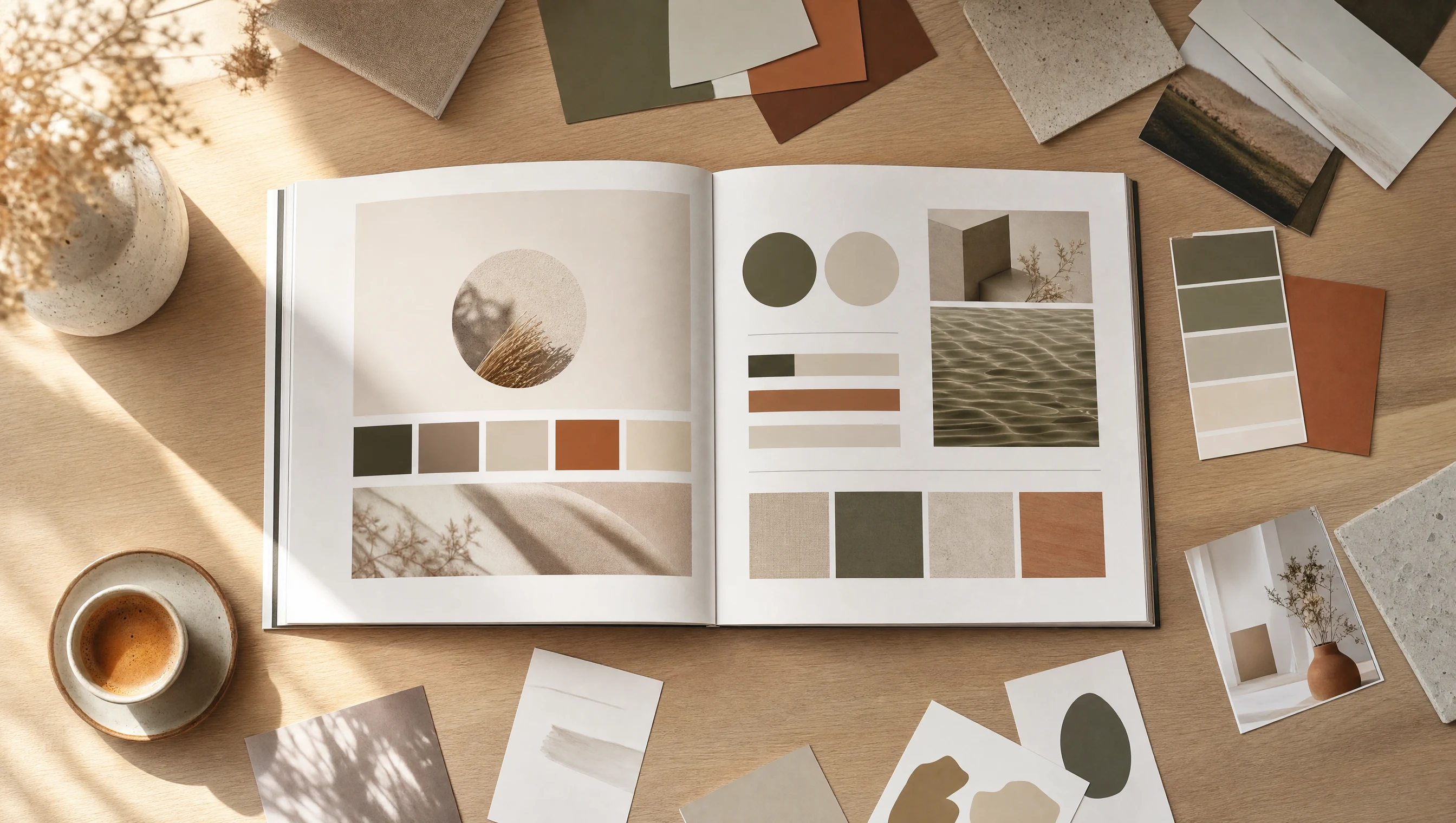
Element 2 — Personality: Let Your Typography and Color Do the Talking
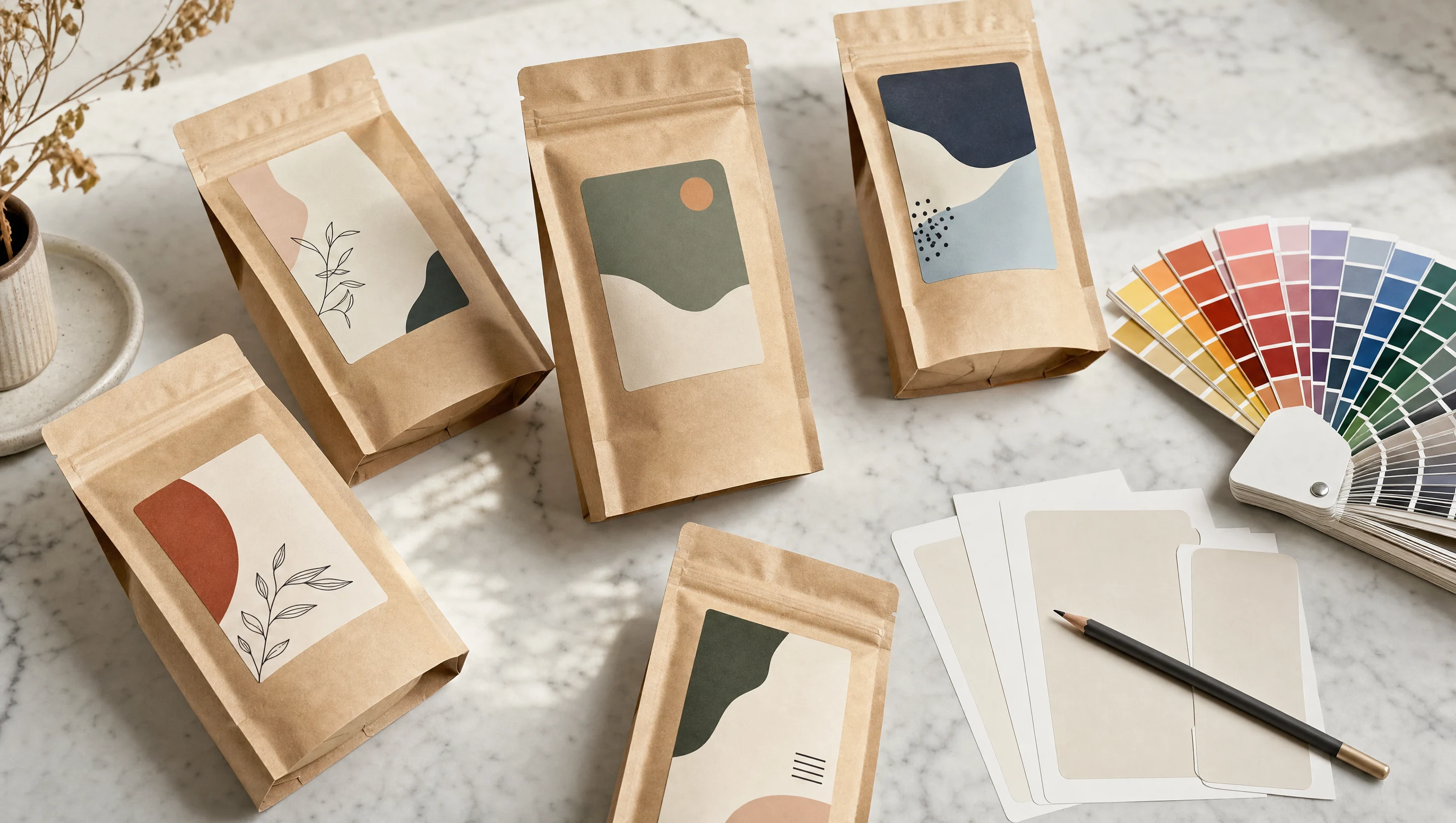
Your typography and color choices communicate brand personality before anyone reads a single word.
A serif label with muted earth tones signals: thoughtful, artisan, premium. A bold sans-serif with high contrast signals: confident, modern, accessible. Neither is wrong — but both are saying something. The question is whether what they're saying matches your brand.
Typography Is Brand Voice Before Anyone Reads a Word
Typeface selection is one of the highest-leverage decisions in coffee label design, and one of the most underestimated. The typeface sets the emotional register of the entire label.
- Legibility at distance matters more than beauty up close. Beautiful calligraphy that's unreadable at arm's length is a liability.
- Script and display fonts earn attention — they don't automatically command it. Use them for brand name and origin; use a readable secondary face for tasting notes and legal text.
- Consistency across your SKUs builds brand recognition. If every bag in your lineup uses a different typeface, the shelf doesn't read as a brand — it reads as a collection of one-offs.
Color Signals Roast, Emotion, and Price Point
In specialty coffee, lighter and more saturated palettes often signal light roast and accessibility. Darker, more muted palettes lean into the craft and depth of medium and dark roast. Bright, high-contrast palettes signal approachability and everyday use.
None of these are rules. But they are defaults the buyer's brain applies automatically. If your label is working against category defaults, you need a strong reason — and your other design elements need to carry the explanation.
Element 3 — Hierarchy: Structure Your Label Like a Shelf Sales Pitch
A coffee label should be read in layers — not all at once.
Layer one is the glance: brand name and origin (or blend name). Layer two is the decision: roast level, roast style, or product line. Layer three is the reward: tasting notes, processing information, and the story for buyers who want to go deeper.
What Goes Where — and Why It Matters
A working label hierarchy looks roughly like this:
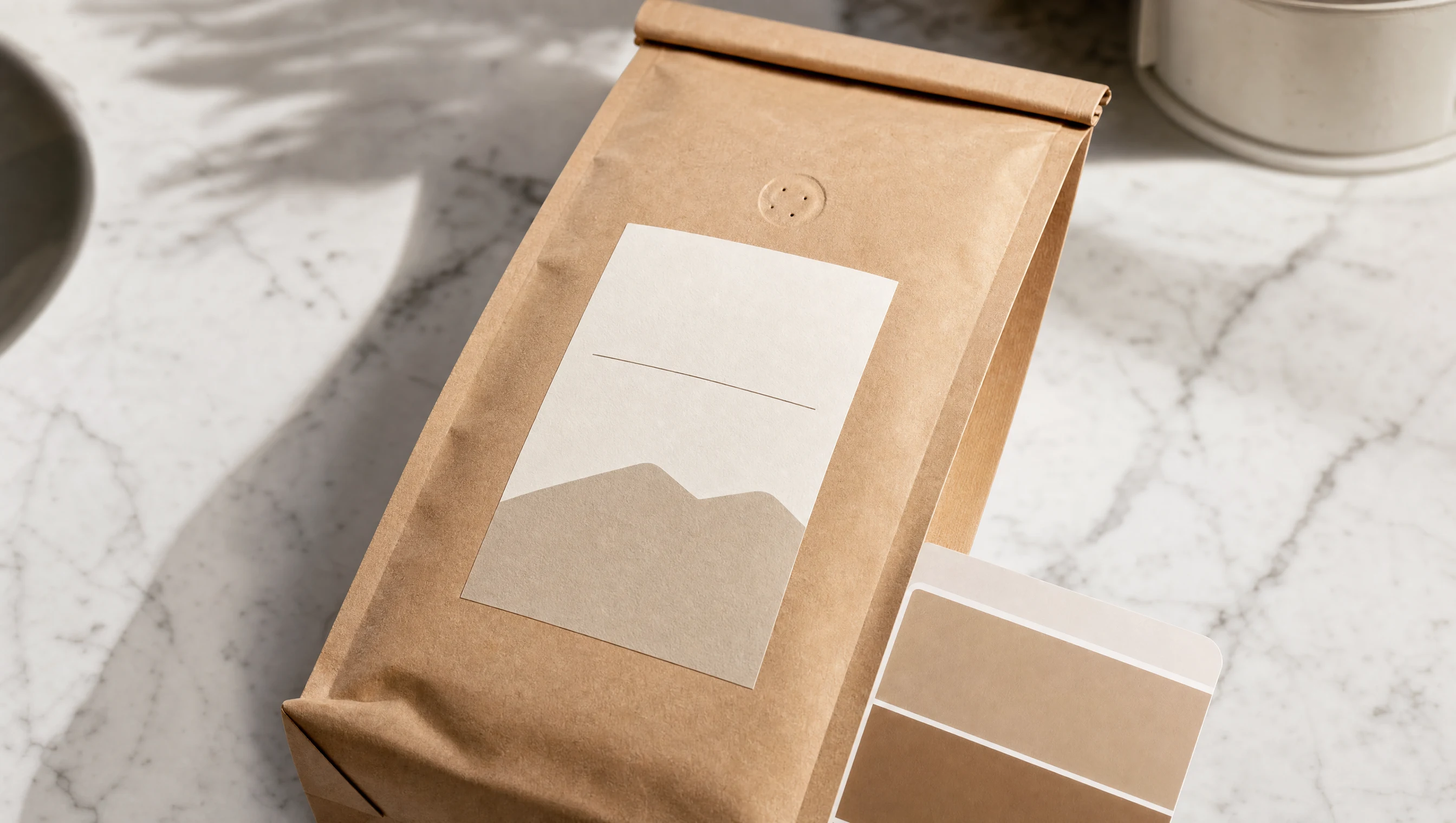
- Dominant (visible at 10 feet): Brand name or logo
- Primary (visible at arm's length): Origin name or blend name
- Secondary (readable up close): Roast level
- Tertiary (for the engaged buyer): Tasting notes, processing method, farm name
- Required (legal, small): Weight, country of origin, allergen info
When roasters come to us for a rebrand, hierarchy is usually the first thing we address — not because the visual elements are wrong, but because the information architecture is fighting itself.
Element 4 — Shelf Impact: How Your Label Performs Off the Screen
Screens are backlit, high-contrast environments. Shelves are lit with overhead fluorescents, natural light, or dim ambient lighting — often all three at once. A label that looks rich and saturated on screen can look dull and muddy in-store.
The Screen-to-Shelf Gap
This is the most common single cause of label failure: the label was never tested in a shelf environment before going to print. Before approving a final design:
- Print a physical proof before signing off. The finished label material will behave differently than what you see on screen.
- View it alongside competitors. Put your label next to three or four competing bags from three feet away.
- Test in different lighting. Check under warm incandescent light, cool fluorescent, and natural daylight.
- Check at actual shelf height. A label gorgeous when laid flat may lose impact at the angle it will actually occupy on a retail shelf.
How to Audit Your Label Before Reprinting
- Run the 3-second test on your current label. Be honest.
- Ask a stranger (not a coffee person) what they would pay for the bag and why.
- Compare your label hierarchy to your Shopify product page. Do they tell the same story in the same order?
These three steps alone will surface almost every issue worth addressing before you touch a design file.
Frequently Asked Questions
What makes a coffee label stand out on a retail shelf?
A coffee label stands out when it leads with clarity, expresses distinct brand personality through typeface and color, and performs visually under real shelf lighting conditions — not just on a screen. Contrast and hierarchy matter more than complexity.
How many elements should a coffee bag label include?
Every coffee label needs brand name, origin or blend name, roast level, and net weight at minimum. Tasting notes, processing method, and certifications are valuable additions — but they should sit in the tertiary layer of the hierarchy, not compete with the primary information.
What's the most common mistake indie roasters make with coffee label design?
Designing for how the label photographs rather than how it performs at shelf. Most indie roaster labels look excellent on Instagram but lose impact in a real retail environment because the design wasn't tested in the physical context it actually competes in.
How do I know if it's time to redesign my coffee label?
Three signs: you're embarrassed to hand it to a new customer, the packaging doesn't reflect the quality of what's inside, or your label looks visually inconsistent with your website and social content. Any one of these is enough reason to look at a refresh.
Your label is the first conversation your brand has with a buyer. Before they read a word, it's already communicating — through typeface, color, hierarchy, and shelf presence. Getting those four elements right won't guarantee every sale. But getting them wrong will cost you sales you'll never know you lost.
Follow us for more on building indie coffee brands that work in the real world.