Most coffee brands are running two businesses inside one brand — and they don't know it.
There's the retail strategy: the packaging, the shelf placement, the in-store experience. And there's the e-commerce strategy: the Shopify store, the email sequences, the Instagram ads. Two teams, or two modes of the same person, working in parallel.
The problem isn't effort. The problem is the split.
When your retail presence and your online store don't look, sound, or feel like the same brand — you lose the same customer twice. The buyer who found you on shelf can't find you online. The buyer who found you online doesn't trust the bag in the store. You've built two first impressions for the same person, and neither one is strong enough to close the loop.
The brands winning both channels aren't doing more work. They're doing different work — work that starts from one place.
The Fragmentation Problem
Here's how fragmentation usually happens.
A small roaster launches at a farmers market. They design a bag, build some brand presence, start selling. It works. Then someone suggests building a Shopify store. They hire a web designer (or build it themselves), and the site goes live — but it was built separately from the packaging, so the visual language drifts. Different colors, different hierarchy, different voice.
Then Instagram becomes important. Now there's content to produce — but the content team (or the founder wearing that hat) is working off vibes and inspiration, not a brand system. The feed looks different from the packaging, which looks different from the site.
Six months later, a new customer finds the brand on shelf, loves the bag design, goes to the website — and isn't sure they're in the right place. The trust built by the packaging doesn't transfer. The sale doesn't close.
This isn't a design problem. It's a systems problem.
What a Brand System Actually Is
A brand system is the set of rules that makes your brand recognizable across every surface it touches. It's not a mood board or a logo file. It's a set of decisions, made once, that travel everywhere.
For a coffee brand, a functional brand system has three layers:
Visual hierarchy — the order in which your brand communicates. Brand name first, then hero visual (the coffee, the origin, the farmer), then key claim (single-origin, direct trade, small-batch roasted). This hierarchy should be identical on your packaging, your product page, your social posts, and your email header. When the order matches, the buyer's brain doesn't have to relearn your brand at every touchpoint. It just recognizes you.
Color language — not just your brand colors, but how you use them and what they signal. Your primary color is attention. Your secondary color is trust. Your accent is action. These roles should be consistent whether someone is looking at your bag on a shelf, your hero image on Shopify, or a story on Instagram. When the color language is consistent, recognition happens in milliseconds — which is exactly how long you have.
Voice — the personality behind every word you write. Is your brand warm and personal? Precise and technical? Irreverent and confident? Your packaging copy, your product descriptions, your Instagram captions, and your email subject lines should all sound like the same person wrote them. Not because one person did, but because there's a clear enough voice that anyone on the team can write in it.
These three layers — hierarchy, color language, voice — are the minimum viable brand system. Get them aligned across retail and e-commerce, and the fragmentation problem disappears.
The Shelf-to-Screen Test
Here's a practical audit you can run today.
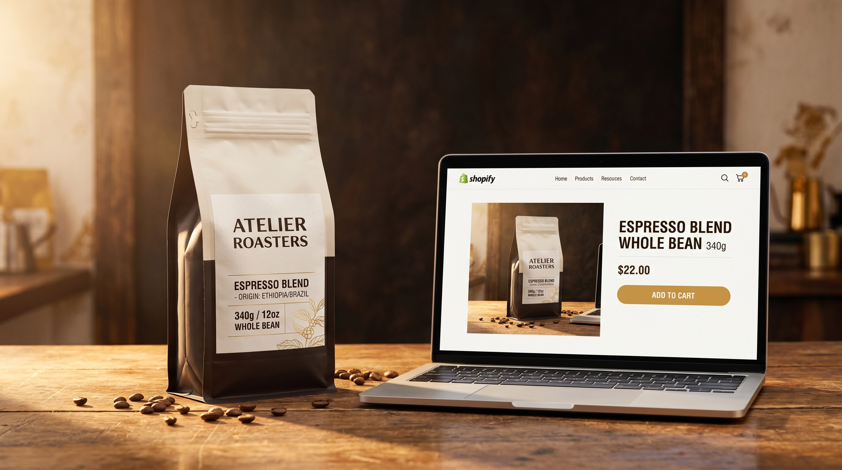
Pull up your packaging — or a photo of it — and your Shopify product page side by side. Ask three questions:
1. Does the visual hierarchy match? On your packaging: what's the first thing your eye goes to? What's second? What's third? Now look at your product page. Does the hero image lead with the same element? Does the product title sit at the same visual weight as the brand name on the bag? Is the key claim — your origin, your process, your differentiator — in the same position in the visual order?
If not, you have a hierarchy mismatch. The buyer who came from the shelf is looking for the signals they already recognized, and they're not finding them.
2. Does the color language transfer? Take the dominant color from your packaging. Is it the dominant color on your product page? Is it in your CTA button, your header, your hero background? Or did the web design drift into a generic Shopify theme palette that has nothing to do with your bag?
3. Does it sound like the same brand? Read the copy on your packaging out loud. Then read your product description out loud. Do they sound like they came from the same person? Same rhythm, same vocabulary, same level of warmth or precision? If one sounds like a founder talking to a friend and the other sounds like a product listing, you have a voice gap.
Most brands fail at least one of these three. Many fail all three.
How to Fix It — Starting from the Bag
The packaging is almost always the most deliberate, most considered piece of brand work a small roaster does. It went through a design process. Decisions were made consciously. It represents the brand at its most intentional.
Start there.
Take your packaging and write down, explicitly:
- The visual hierarchy (what's first, second, third)
- The exact hex codes or Pantone values of every color used
- Three adjectives that describe the voice of the copy on the bag
Now treat those as the brief for everything else.
Your Shopify product page gets rebuilt with the same visual hierarchy. Your hero image leads with the same element your bag leads with. Your product title has the same visual weight as your brand name on the bag. Your key claim sits in the same position.
Your site's color palette gets updated to match. Not a copy of the packaging — design for screen is different from design for print — but derived from the same system. Same primaries. Same roles.
Your product descriptions get rewritten in the voice you identified. If the bag sounds warm and specific, your product page sounds warm and specific too. Not a template — a sentence written by a person who cares.
Do this once. Document it. Every new SKU, every new campaign, every new piece of content starts from this document.
Why This Compounds
The reason brand system work pays off disproportionately is that it compounds.
Every touchpoint that's consistent with every other touchpoint builds recognition. Recognition builds trust. Trust lowers the barrier to purchase — on the shelf, on the site, in the inbox.
A customer who recognizes your brand across every surface they encounter it doesn't have to make a new decision each time. They already decided. The recognition does the closing.
This is why the largest coffee brands win even when their product is mediocre. Not because of quality — often despite it. Because their brand is so consistent, so present, so recognizable, that the purchase feels like a foregone conclusion.
The advantage small brands have is authenticity. The brand system is what lets that authenticity travel. Without a system, authenticity stays on the bag. With a system, it goes everywhere.
The One-Week Audit
You don't need a rebrand. You need an alignment.
Here's what one focused week looks like:
Day 1–2: Pull your packaging, your Shopify store, and your Instagram side by side. Document every misalignment — visual hierarchy, colors, voice. Don't fix anything yet. Just see it clearly.
Day 3: Pick the three most visible misalignments. The ones a first-time visitor would notice. These are your priority fixes.
Day 4–5: Fix them. Update your product page hero. Rewrite two product descriptions. Update your site's accent color to match your packaging. Small, high-visibility changes.
Day 6–7: Document what you did as a standard. One page: your visual hierarchy, your color hex codes, three adjectives for your voice. This is your brand system brief.
You've just aligned your retail and e-commerce presence in a week. Not perfectly — brand systems take time to propagate fully — but enough that a customer moving between shelf and screen now recognizes they're in the same place.
That recognition is worth more than any individual campaign you'll run this quarter.
Frequently Asked Questions
why is brand consistency between grocery shelves and a shopify store so critical for roasters?
When your physical retail presence and your digital storefront don't look, sound, or feel like the exact same entity, you end up losing the same consumer twice. A shopper who falls in love with your physical bag on a grocery shelf will often search for your brand online. If they arrive at a website with a mismatched visual hierarchy or an entirely different color palette, their brain fails to transfer the trust built in-store. A unified brand system ensures immediate recognition, reducing the cognitive friction required to close an online sale.
what are the fundamental layers of a functional e-commerce brand system?
A successful brand system is not just a collection of logo files or a loose mood board; it consists of three highly disciplined operational rules that travel across every channel:
- Visual Hierarchy: The specific structural order in which your brand communicates its information (e.g., brand name first, hero origin element second, key product claim third) across all web pages, packaging labels, and emails.
- Color Language: Strategic, fixed roles assigned to your brand palette, where your primary color always commands attention, your secondary color builds trust, and your accent color consistently signals user action (CTAs).
- Voice: A defined personality blueprint that governs the rhythm, tone, and vocabulary of every written sentence—from short Instagram captions to formal product listings.
how can a coffee shop run a shelf-to-screen audit on its packaging?
You can perform an immediate shelf-to-screen audit by placing your physical retail bag directly next to an open window of your Shopify product page. Analyze if your digital hero image elevates the exact same design element that catches a shopper's eye on a grocery shelf. Next, verify if your website title matches the visual weight of your physical bag typography, check if your primary web colors precisely mirror your physical packaging hex codes, and read your product descriptions aloud to ensure they sound like they were written by the same individual who wrote the copy on the back of your bag.
where should an indie roaster start when aligning their online and offline branding?
When resolving brand fragmentation, always begin with your physical coffee packaging. For most independent roasters, the physical bag is the most intentional, deliberately budgeted piece of design work they possess. Document your packaging layout's visual hierarchy, extract the precise hex codes of the colors used on the material, and pinpoint three core adjectives that capture the emotional tone of the bag copy. Use this breakdown as your absolute creative brief to rewrite your Shopify product pages, realign your social media aesthetics, and restyle your email marketing headers.
To ensure your digital copy carries this identity flawlessly without sounding flat, follow our complete masterclass on How to Build a Brand Voice That Actually Sells Coffee.
how long does it take to fix branding misalignments between physical and digital storefronts?
You can execute a meaningful brand alignment in exactly one week by running a focused seven-day sprint. Use the first two days to audit your store and visually map out every core mismatch across your packaging, Shopify layout, and social channels. On day three, isolate the three most glaring discrepancies that a first-time consumer would easily notice. Dedicate days four and five to launching quick, high-impact digital adjustments—like updating your Shopify primary accent colors or refining two core product descriptions. Spend the final two days documenting these rules into a simple, one-page brand system guide to streamline future growth as you scale your infrastructure following The Shopify Scaling Guide for Indie Coffee Roasters.
Inkroast helps coffee brands build packaging, Shopify stores, and brand systems that work together. If your shelf and your screen are saying two different things, that's where we start.
Follow @theinkroast or DM us ONE to begin the audit.